Periwinkle
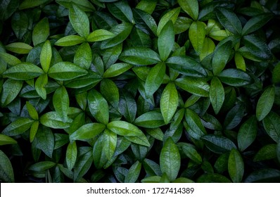
Periwinkle is a soft blue with hints of violet, often considered a less-purple counterpoint to lavender. The name was first used to describe this shade in 1822 England, and likely derived from the periwinkle plant, an evergreen perennial now common in the Southern U.S. Homeowners who want to experiment with colorful palettes can introduce periwinkle to create a grounding effect. For a vibrant scheme that exudes light, try pairing it with lemon yellow and spring green. With green and white, it brings out the beauty of a lush garden indoors for classic, rustic appeal. Mint, periwinkle, iris, and ivory are also traditional combinations that still look fresh and clean. Deeper shades of this light blue can be used to add a pop of color to neutral schemes, especially as a juxtaposition to black and white. Pair with other shades of blue for a monochromatic effect that’s anything but boring. If this pastel seems too sweet, add a sophisticated edge with modern lines and metallic accents, or turn up the volume with a splash of pumpkin orange.
#CCCCFF
#CCD9FF
#8F98B3
#F2F5FF
#E6ECFF
Find more colors
Get inspiration and creative tools

Complete Guide to Color in Design
Learn everything you need to know to successfully use color in design. Discover color theory, color meanings, and color modes to help you pick the right palette for your work.

Ready to start designing?
Try Shutterstock Editor, the easy and efficient design application. Create professional-looking social media posts, promotions, and more.


