Burnt Orange
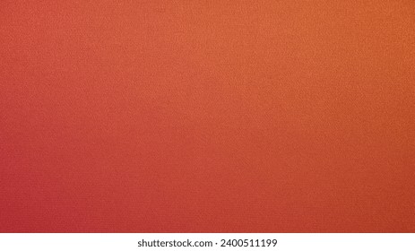
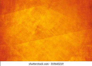
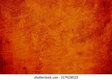
Burnt orange is a rich, warm brownish-hue that evokes feelings of rugged desert adventures and crisp autumn mornings. Super versatile, this hue goes well with warm colors, cool colors, and neutrals. It also looks fantastic with warm neutrals, such as beige, gray, burnt sienna, and sorrel brown. If a neutral palette isn’t your thing, shift the look and make burnt orange dramatic by using it to accent black, white, or navy blue. However, if you want to really make this dynamic shade pop, pair it with its complementary colors, such as teal green and midnight blue.
More Information About Burnt Orange
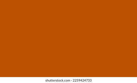
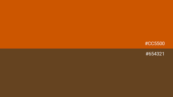
Burnt orange can be defined by several HEX codes, depending on the desired shade. A standard shade is often represented by #BF5700, a deep and vibrant hue that captures the classic essence of the color. A darker, more subdued variety can be represented by #8A3700, which leans towards a richer appearance with increased brown tones. A lighter version—like #D9822B—offers a brighter shade, closer to traditional orange but retaining the depth of burnt orange. Another popular variant, #CC5500 (also known as "burnt sienna") provides a sonorous, deep hue, blending red and brown tones effectively.
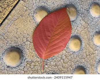
Burnt orange, a deep and earthy hue, is reminiscent of autumn leaves under a harvest sun or the glowing embers of a cozy evening fire. A blend of red and orange, this fiery hue captures the essence of its namesake—the transformative state of something exposed to flame, imbued with a warmth both comforting and invigorating. Historically, burnt orange has been a color of substantial presence, often associated with the changing seasons, symbolizing transition and endurance.
In the ancient world, colors akin to burnt orange were often derived from minerals or plants, and were considered luxurious due to the labor-intensive process of extracting the dye. The Egyptians, for instance, created an orange pigment from realgar (a mineral) and used it in their art and hieroglyphics. During the Renaissance, burnt orange gained prominence in the artworks of masters, who used them to bring warmth and realism to their paintings. In the 20th century, burnt orange became associated with the counterculture movements of the 1960s and ‘70s, representing change, freedom, and a break from traditional norms. The era also saw this bold hue used lavishly in fashion, graphic design, and interior décor. The enduring appeal of burnt orange lies in its rich depth, and the historical and cultural journey it has taken to become the beloved color it is today.
Burnt orange, with its blend of warmth and vibrancy, makes it a symbol of comfort and joy, evoking feelings of security and happiness. This shade of orange also conveys a sense of stability, strength, and endurance. It's a color that embodies the resilience and reliability of the earth itself, reminiscent of the varied tones of soil, clay, and the natural world. Burnt orange is synonymous with creativity and innovation, often associated with artistic expression and a break from the conventional. As a symbol of transition and change, it encapsulates the dynamic nature of life, highlighting the beauty and adaptability inherent in the world around us.
Burnt orange harmonizes beautifully with neutrals like cream, beige, ivory, charcoal gray, and deep brown, creating an invitation for ambiance. For a more striking contrast, this shade pairs well with cooler tones such as teal, turquoise, deep navy, sage green, olive, and lime green. Metallics like gold, bronze, and copper also compliment burnt orange, adding a touch of glamor and richness. Incorporating other warm tones like yellows, reds, or lighter oranges creates a vibrant and energizing palette, while pairing it with blue results in a bold, eye-catching combination. Whether aiming for subtlety or vibrancy, this hue's flexibility makes it suitable for a wide range of design contexts.
Burnt Orange Color Conversion and Values
Value | CSS | |
|---|---|---|
Hex Code | CC5500 | #CC5500 |
CMYK | 0, 58, 100, 20 | |
RGB Percentage | 80, 33.3, 0 | rgb(80%, 33.3%, 0%) |
RGB Decimal | 204, 85, 0 | rgb(204,85,0) |
Hue Saturation Lightness (HSL) | 25°, 100, 40 | hsl(25°, 100%, 40%) |
Web Safe Color | CC6600 | #CC6600 |
Binary | 11001100, 01010101, 00000000 |
Similar Colors to Burnt Orange
Burnt Orange vs Brown
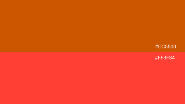
Burnt Orange vs Red Orange
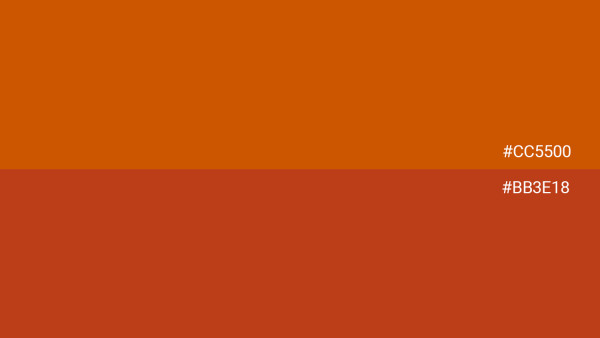
Burnt Orange vs Cayenne
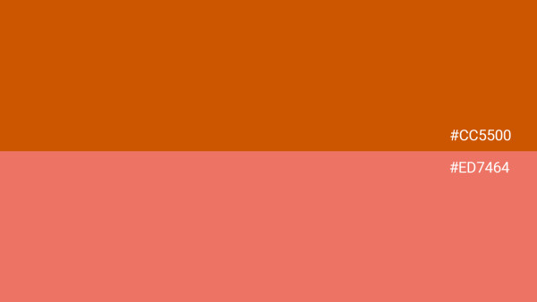
Burnt Orange vs Coral
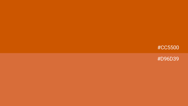
Burnt Orange vs Jaffa Orange
From the Blog: Top Color Resources
The Meaning of Colors in Cultures Around the World
Color quite literally colors the way we view our world. Let’s take a deep dive into the symbolism of colors in cultures around the world.

101 Color Combinations to Inspire Your Next Design + Free Swatch Download
In this roundup, we compiled 101 new color combinations to inspire your next project. Download the free swatch files today!
What Are HEX Colors and How They Work in Design
What exactly is HEX color? Learn the definition of HEX colors, how many there really are, and discover how to use them in your designs.
What Is a Color Scheme? Definitions, Types, and Examples
Learn everything you need to know about color schemes and how to apply them to your next interior design, graphic design, or web design project.


